This is a Series of Tutorials, so if you need to start at the beginning, CLICK HERE.
Step #1: Making the HeaderI found this really cool website called Picnik it is so easy to use, and the best part is that it is FREE and NO registration required!! I will show you how I made this header, so that you can make one that is 100% Custom for you!
First, head over to Picnik, and click on Get Started!
Second, I am going to click on Make a Collage.
Then select a layout.
I selected this one and used the Proportions slider to change the height a bit.
Down at the bottom, you can upload your images.
I am going to upload from my Computer. After you upload, drag the photo on to your layout.
I wanted a big spot for my Header title, so I am going to leave the left picture empty. and I am going to change the color to a maroon color that matches my background that I made earlier.
After you get the right color, I have used the Roundedness slider to make the image have rounded edges.
Now just Click on Done in the top right-hand corner.
Now I want to work on the text, so I am going to the Text link at the top.
My title is going to be "Messes with the Reynolds", but I don't want to type the whole thing in just one box, because I want to lay it out cute, so I am first going to just type "Messes" and click Add.
Then pick a cute font. The little circles on the 4 corners allow you to size the word, and the circle on the top allows you to rotate it.
So after I added a few more Text Boxes, and played with the fonts, this is what I came up with.
Now I would like to add a little embellishment, so I am going to click on Stickers at the top.
I found a cute little family drawing that worked perfectly and just dragged and dropped it on to my Header.
Then I went back to the top and clicked on Frames.
There, I picked Rounded Edges, and adjusted it to match my image.
Now if your background is any other color than white, you will want to select Transparent Corners!
If your header looks the way you want it, just go back to the top and click on the Tab that says: Save & Share.
These are the settings that I used to save my photo. I did 1000px wide, so that it would fit just perfect on my wide 2 column template, and I picked png, so that the corners would be transparent, not white. (JPEG files will not allow you to save transparent).
Now my saved Header looks like this!! So cute!
Step #2: Installing your Header
First, you are going to add your header image as you normally would here:
When you upload, make sure that you select Instead of title and description, and do NOT select Shrink to Fit. Then Click Save.
Now your Header will look like this.
Obviously, the borders around it look terrible, and we need to get rid of those, and we need to center it properly. So go to your Edit HTML page, and find your #header-wrapper, and change the border to 0px. So your #header-wrapper should now look like this.
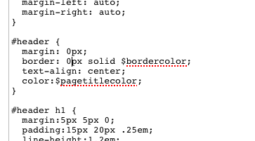
Now go down to your #header, and change the 5px to 0px. Also change the 1px to 0px on your border. So now it should look like this.
Now you're Done!


ConversionConversion EmoticonEmoticon